DisabilitySA

Website Redesign
DisabilitySA was created to be a powerful tool for those with all forms of disabilities. However, the website hasn’t been effective fostering inclusion and engagement, reflected by low participation and limited donor contribution.
How might we improve the website user experience to encourage unity and inspire donor and volunteer participation?
The Solution:
We wanted to empower DisabilitySA to uplift the local disability community through a website that is fully accessible, intuitive, and inclusive. Since many visitors may already face challenges navigating digital environments, the redesign focused on simplifying access to essential resources, reducing cognitive load, and creating a user journey that feels welcoming and supportive.

We designed a testing plan based on improving the website accessibility, navigation, and usability.
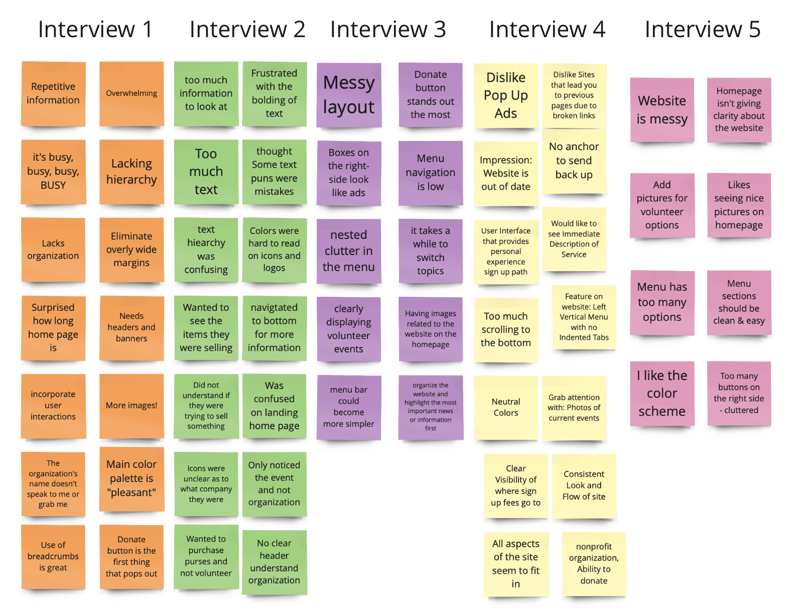
Five participants were asked to provide their initial views of DisabilitySA’s website, including their likes/dislikes and take on accessibility. During these sessions, users were observed to see what they gravitated to first and where they clicked on the page.
The repeated search choices on the page gave different search results per topic, causing the user even more confusion.
We discovered users felt overwhelmed from the amount of text and buttons available from the homepage and further screens.
Affinity Diagram

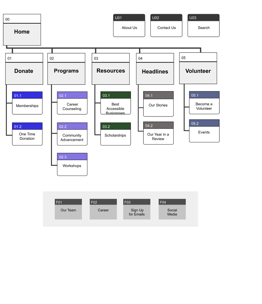
Based on our usability testing results, we refined the site’s information architecture to create a more intuitive and accessible experience. We simplified the navigation, reorganized key content areas, and streamlined the headers and footers to reduce clutter—laying a clear foundation for our first wireframe design.
Information Architecture

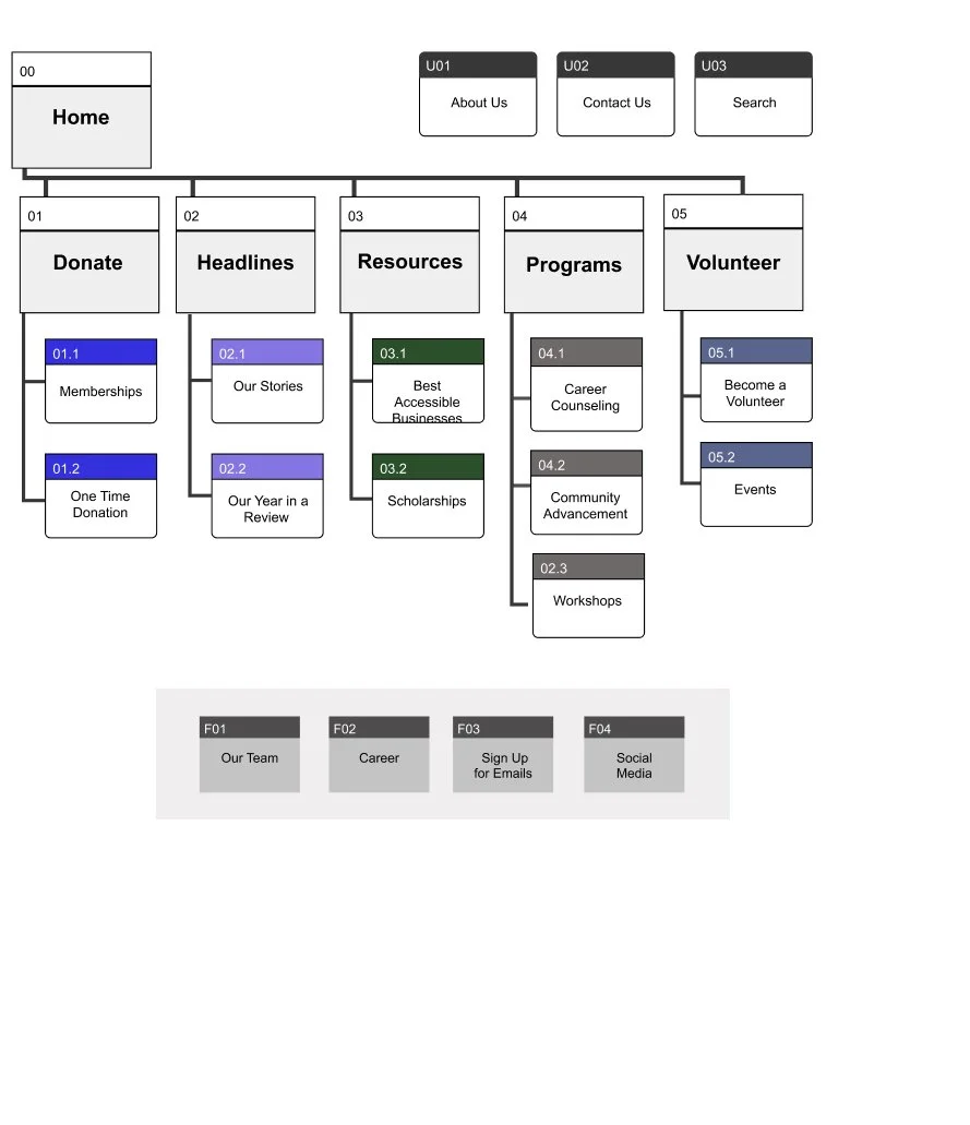
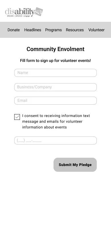
We focused on creating a streamlined and motivating user journey. We optimized the navigation and introduced a prominent “donate” call to action in the header to drive engagement. Text content was reduced for clarity and adaptive layouts ensured accessibility across devices. A progress bar and simplified donation flow were added to encourage completion, supported by a broad donation plan and clear action buttons guiding users through the final steps.
Wireframing & First Iterations

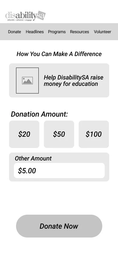

Feedback from our first iteration highlighted cluttered content, visual inconsistencies, small buttons, and alignment issues. Using these insights, we refined the layout, improved accessibility, and optimized usability—culminating in the creation of our final, mobile-responsive prototype.
Final Prototype


